One of my favorite stories from a few years back is Polar Beverage’s launch of a very special sparkling water flavor. Not just any sparkling water flavor, but specifically Unicorn Kisses.
The reaction to this roll-out registered 8.5 on the consumer freak-out richter scale. Because supply was limited some fans of Polar, desperate to know what Unicorn Kisses tasted like, could only do so if they were willing to buy a 1 Liter bottle on eBay for upwards of $100.
So, what does a Unicorn Kiss taste like? Answer: It doesn’t matter.
The brilliance of this launch is that it had absolutely nothing to do with the actual product and nothing to do with the design. Polar developed a highly conceptual approach to their product to electrify brand awareness—especially amongst Millenials. Polar recognized a trend, unicorns, and adopted this trend to capture its audience’s attention. Polar created intrigue, curiosity and humor. When Unicorn Kisses made its debut no one was specifically speaking of the benefits of a calorie-free alternative to soft drinks. No one was speaking of the design. I don’t think anyone even reported on the actual taste. Ultimately the only thing that mattered was that the Polar Beverage Company had Unicorn Kisses on the shelf—and you better hurry because supply is limited.
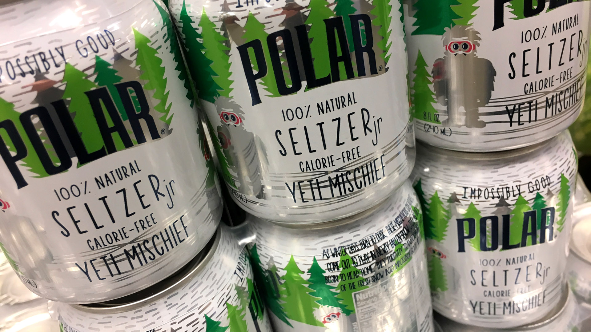
A year later Polar launched three additional limited edition flavors including, “Yeti Mischief”, “Mermaid Songs” and “Dragon Whispers” (replete with adorable illustrations).
Polar repeated their success without wearing out the concept.
What can Private Brands and CPG manufacturers learn from this?
Start thinking conceptually.
Simply renaming a frozen portabella mushroom turn-over, “gnome snuggles” probably isn’t going to work; however, there is always room to engage customers in a way that should be an unexpected surprise. Polar’s creative team deferred a typical flavor profile to something intangible (a real flavor is not even mentioned on the package). It forces the consumer to imagine what a Dragon Whisper might taste like, rather than telling them what it tastes like.
It doesn’t always have to be obvious.
Sometimes authenticity is best served on a small plate. Giving customers the opportunity to discover a bit of humor or whimsy is a bit like letting someone in on a joke—the reward is stumbling upon something that everyone might not find or “get”. When Polar released their second edition of their fun flavors they did so in small 8 oz aluminum cans instead of bottles. If you look at the design closely they call out the beverages as “Seltzer Jr.”. They took adorable and added a dash more of adorable.
Be fearlessly creative.
It’s never been more important to creatively bridge the gap that exists between product and design. The two things are not mutually exclusive. It’s not just how something tastes or how a product presents, it’s also about giving the customer the opportunity to imagine how that product will be experienced. (It took me five seconds to get in my car before I cracked open my first “Yeti Mischief.”)
Make it fun.
Grocery shopping is inherently not fun. The ability to make someone smile during this experience is big. With ever-evolving shopping habits also shifting to on-demand and online, a product additionally has to be able to transcend a modicum of whimsy through the screen. Stumbling upon Polar’s Seltzer Jr. cans made my day—and yes I even stopped to take a photo.
If you work in grocery as part of an in-house team, find ways to bridge your merchandising and design departments. Stop thinking in terms of binary when it comes to PRODUCT and DESIGN and start thinking about a product as a total and complete experience. (A complete experience that hopefully is full of gnome snuggles.)


