
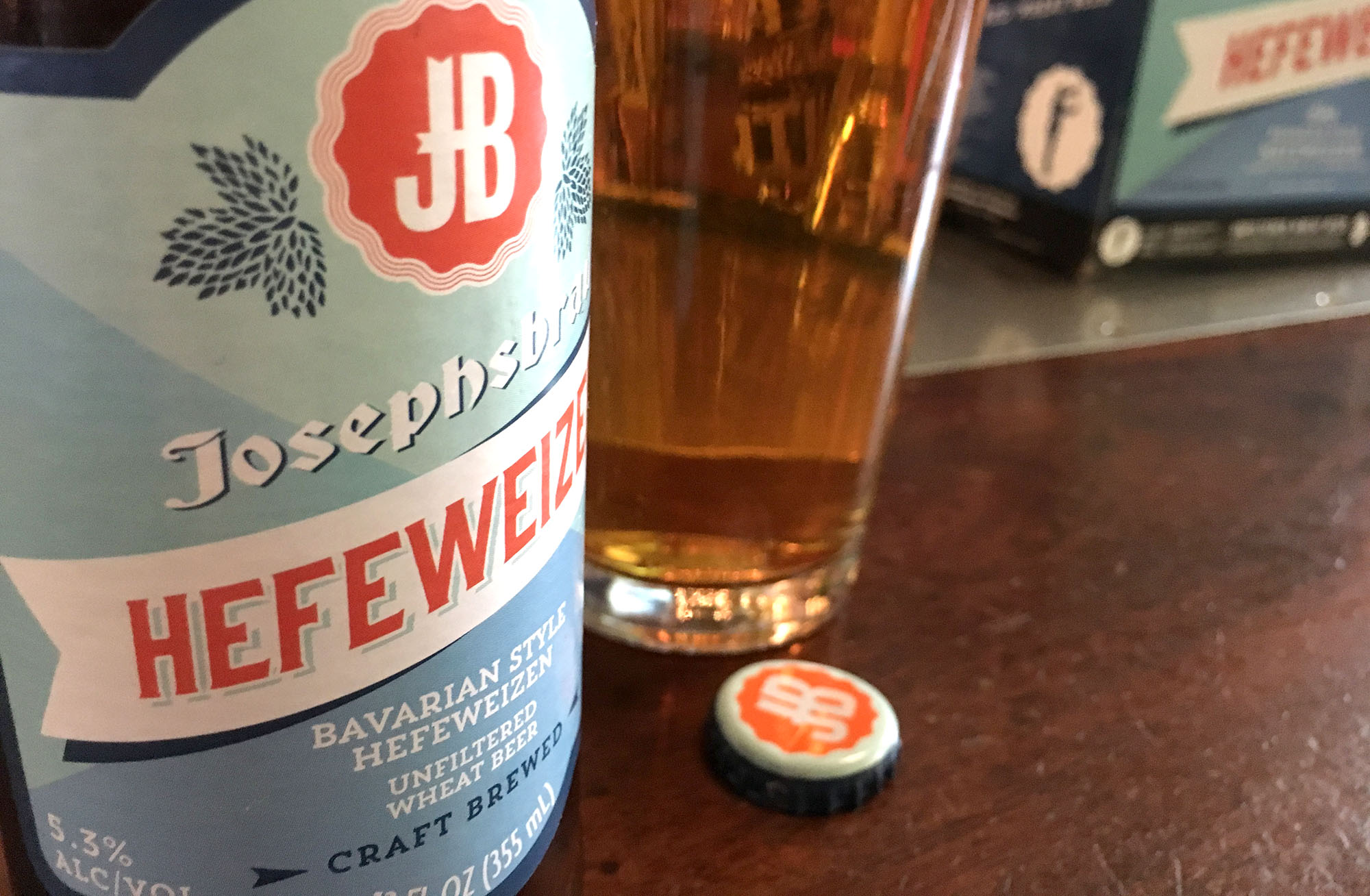
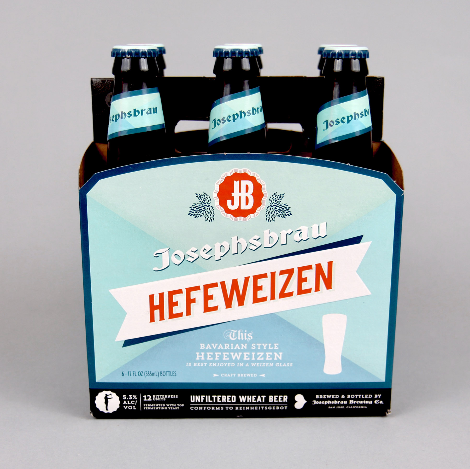
trader joe's control label of beer, josephsbrau, was due for a facelift. I was tasked with both rebranding the line and scaling the brand into seasonal varieties of the beer. talk about a dream project... beer me!
The problem with the existing designs was inconsistencies across the range. Additionally, in a sea of super exciting craft brews (with impossible-to-ignore brand and design execution), the existing designs were not particularly compelling. Also lacking... a story.
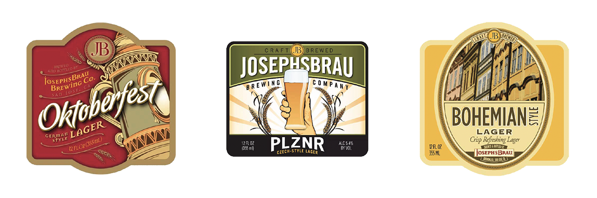
Pre-rebrand label designs
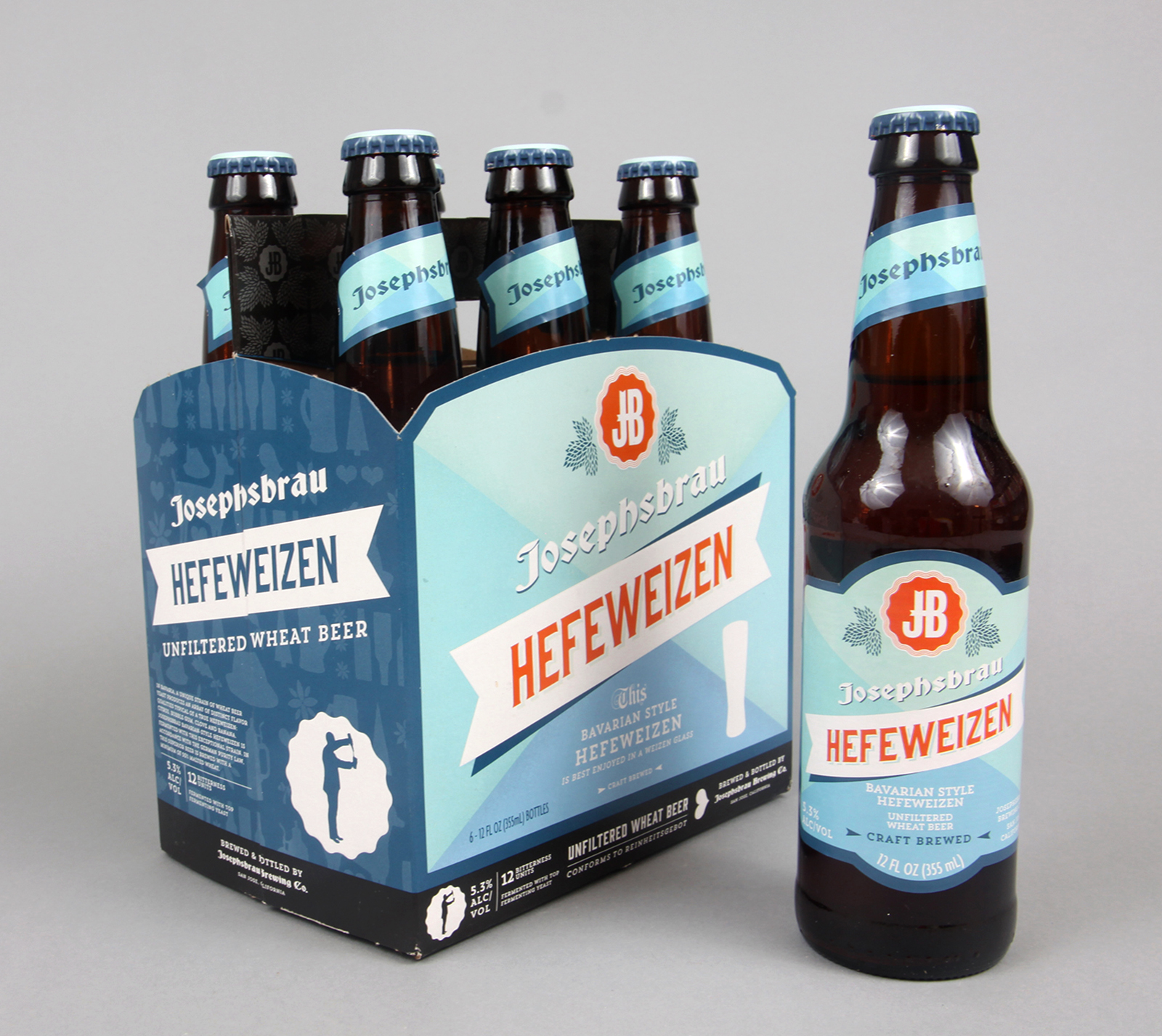
I established core brandmarks that easily scaled across the Josephsbrau range.
The intent was to capture the spirit of the beers heritage while positioning the products to be competitive in a crowded space. Additionally, I created a suite of silhouettes that could be used as a supporting pattern or as individual elements.


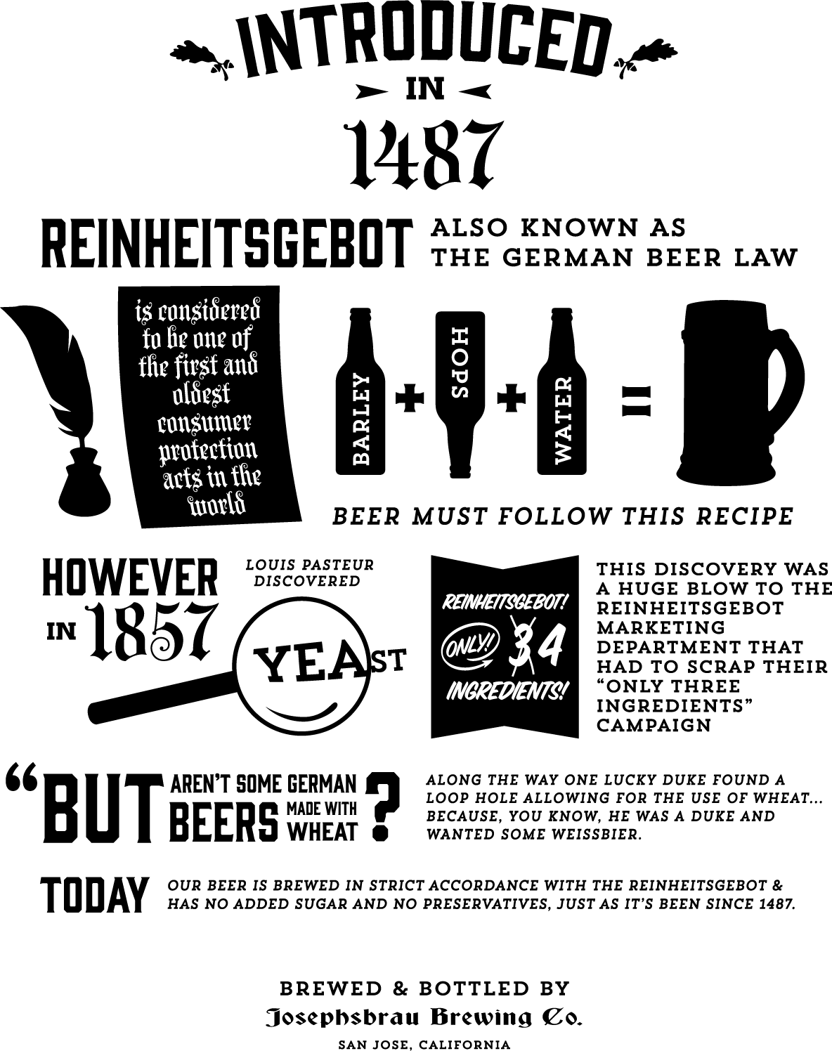
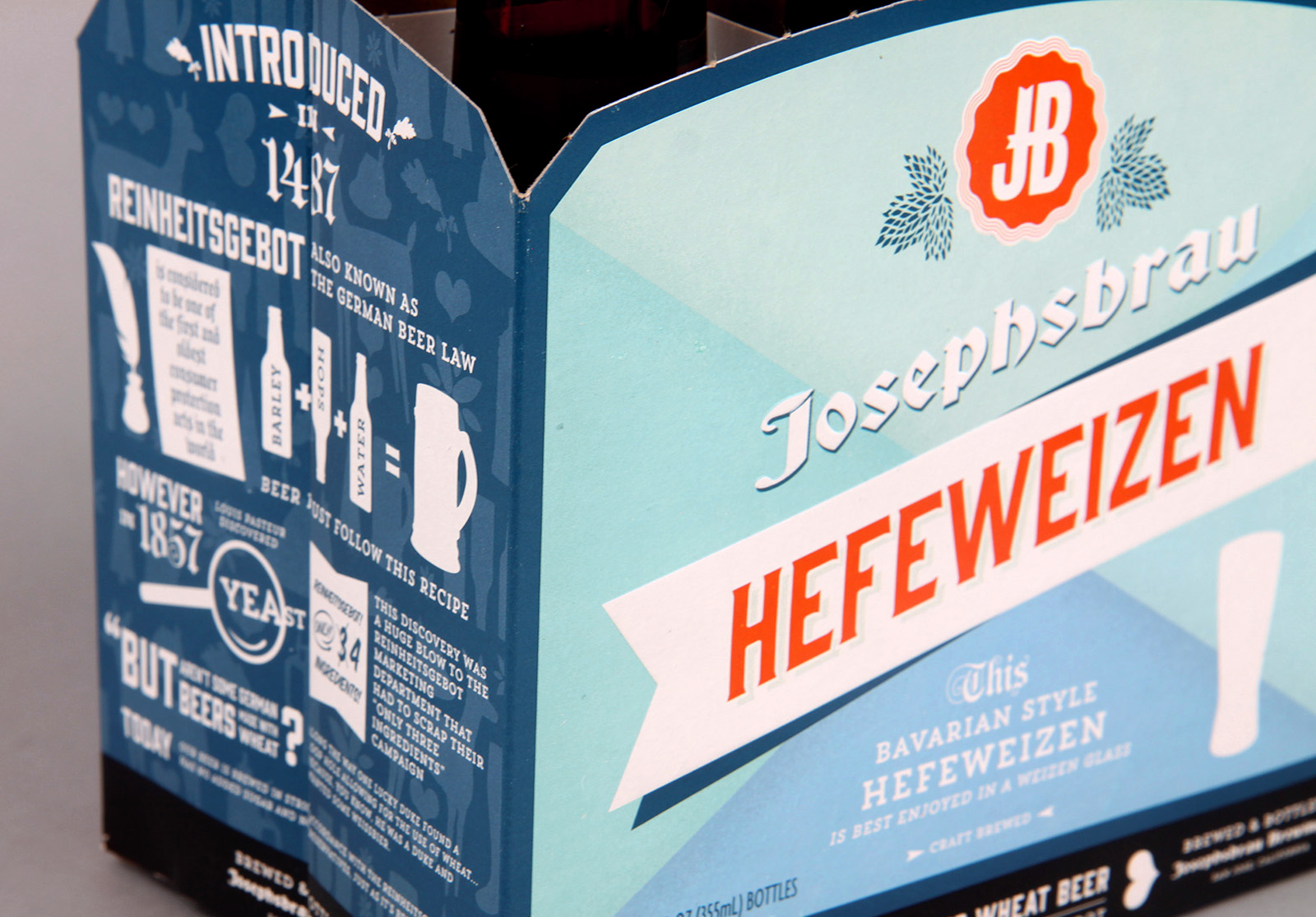
During the discovery phase of this project I learned something about the brewing method used for these beers, Reinheitsgebot, otherwise known as the German Beer Law. the brand now had a story!
Not only was I the designer for this project, but also the copy chief. I wrote the story out, which was interesting enough, but later thought, "no one is ever going to read this".
I then put on my clever-hat and crafted an infographic of the story. I think my favorite part of this whole thing is the bit about the Reinheitsgebot marketing department having to scrap their only 3 ingredients campaign.
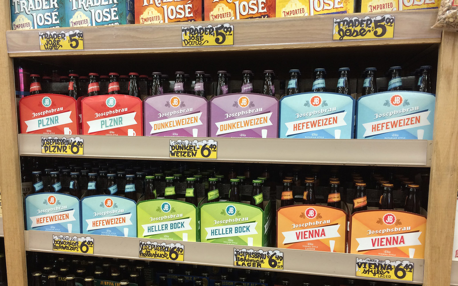
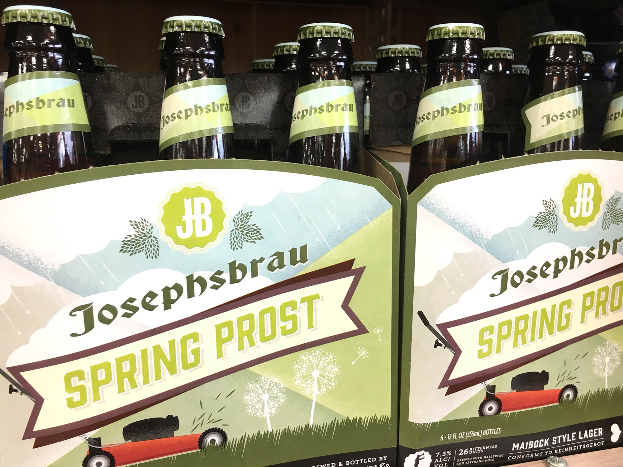
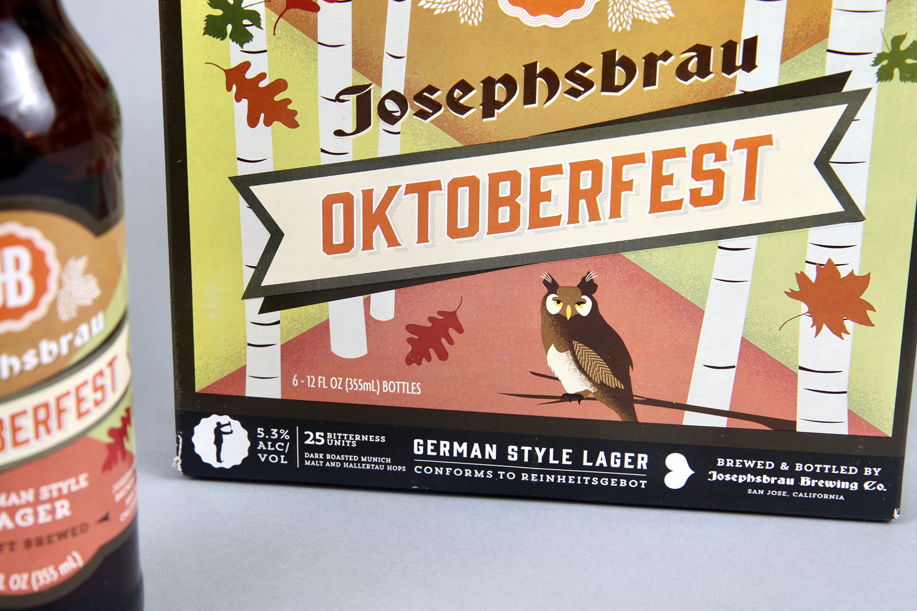
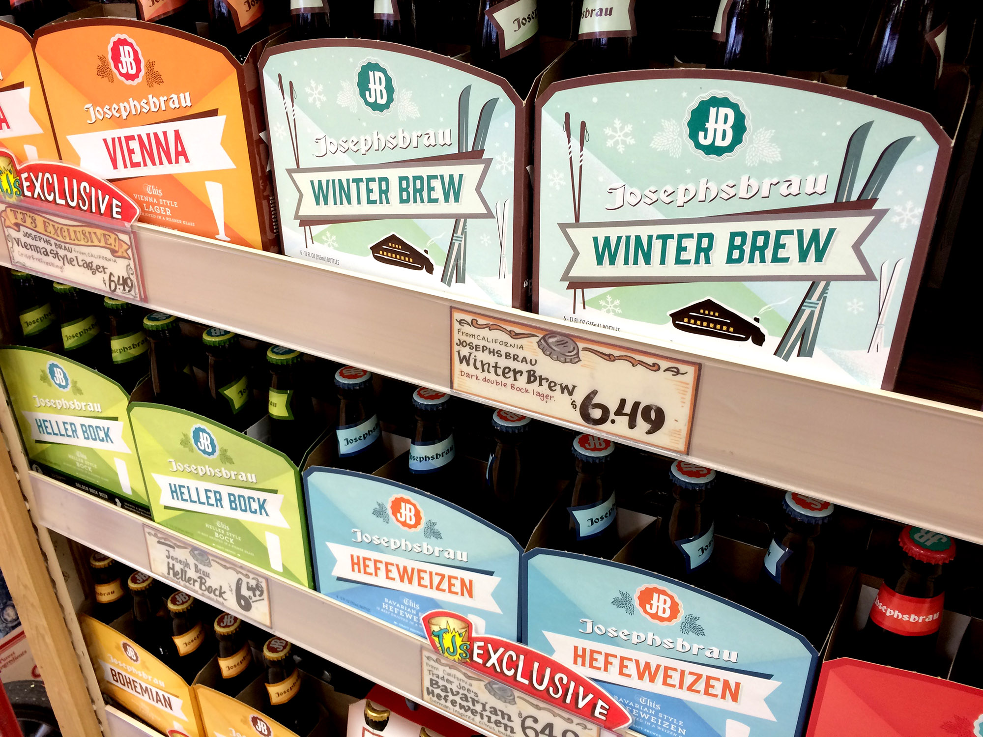
the seasonal varietals of josephsbrau required a little something extra to distinguish the limited releases from the conventional range.
I opted to keep the overall design matrix in place; however, instead of solid color blocking I implemented illustrations that punctuated the seasonality of the brew. I personally executed all of the illustrations--stylistically based on screen printed WPA-era posters.