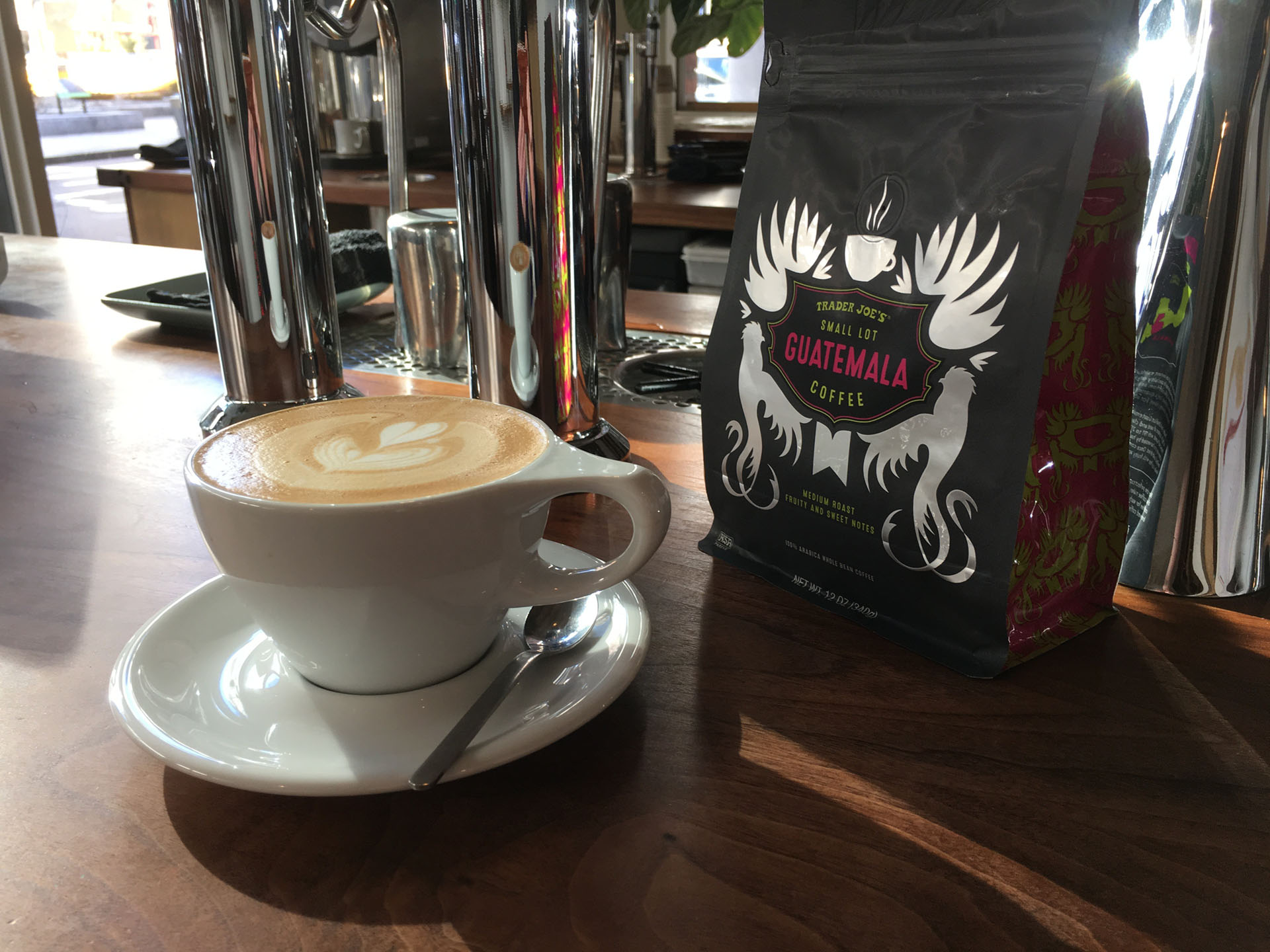
This is a design for a Trader Joe’s Small Lot coffee program (coffees with a 2-3 month shelf presence). Due to the limited time in stores these coffee designs deviate from any established line-look and thusly benefit from quite a bit of design freedom.
There's this funny idea that you get to a certain point in your design or creative career and you stop designing. You ascend to the height of Creative Director, or if you're born under a good sign--Chief Creative Officer, and suddenly most of your time is spent conceptualizing, fighting for the greater good of design, navigating Google decks & sheets, and managing a team of creatives.
This may be partly true; however, I cannot imagine a world where I wasn't setting the example by imparting my wisdom simply by designing.
One thing I talk to young designers about is: the importance of process. It's often absent in the work. It's painful to observe someone moving a bunch of stuff around on a screen before thinking about what it is they are trying to accomplish. This is a walk-through of my creative & design process.
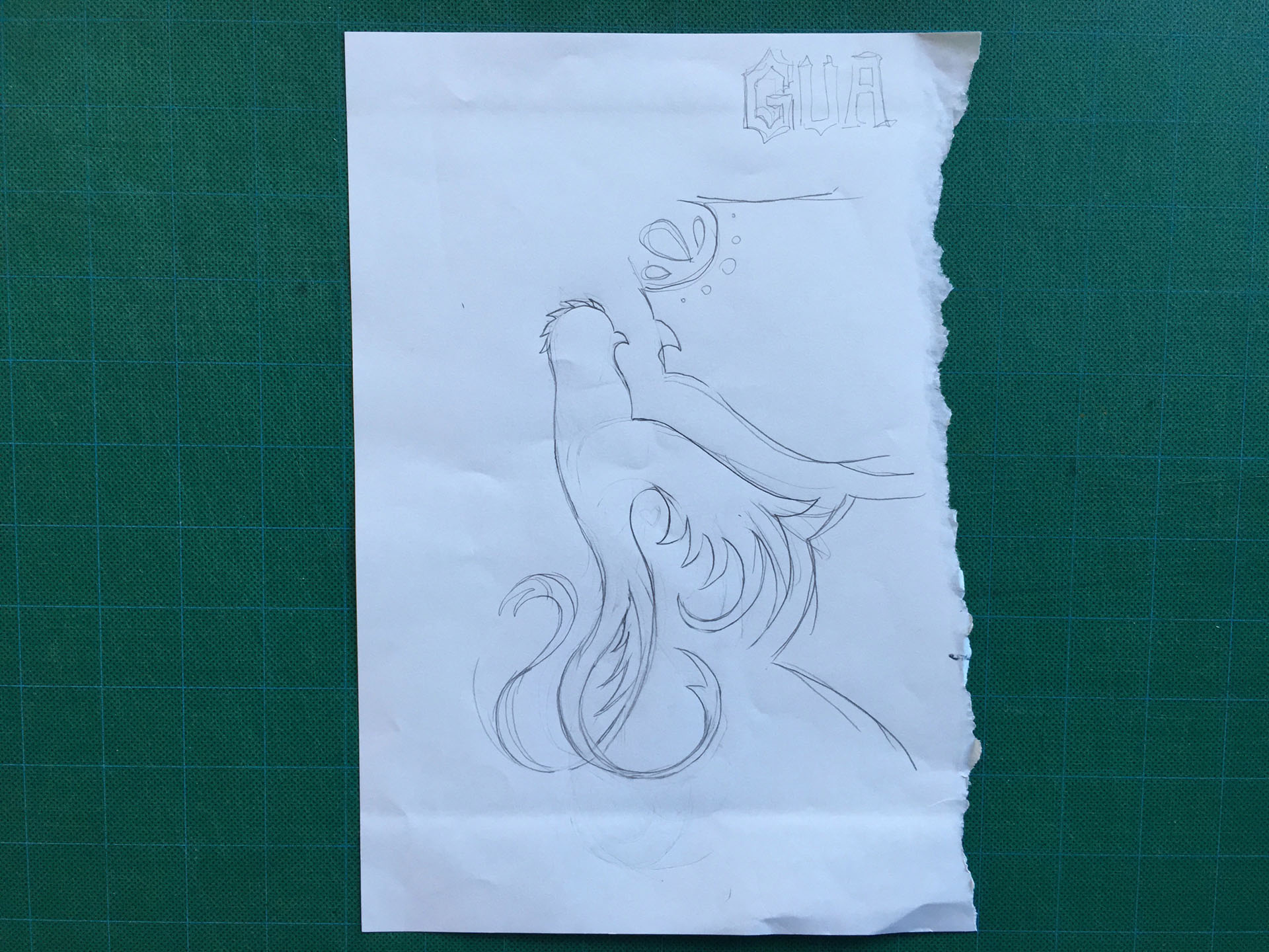
When I was 15, my parent's friends gave me two super-cool Guatemalan shirts (oh man, I wish I still had them) with the country's symbol the Quetzal bird embroidered on them. Rather than tapping into burlap or other coffee tropes, I decided to create a modern crest for these beans featuring the Quetzal.
Old fashioned, right? I've worked on the iPad Pro and I have no apologies about saying I still like real pencil on real paper. Everything becomes digital, but nothing compares to the analog experience of graphite. In this case, I've taken my sketch into Illustrator and created my vector shape of the Quetzal.
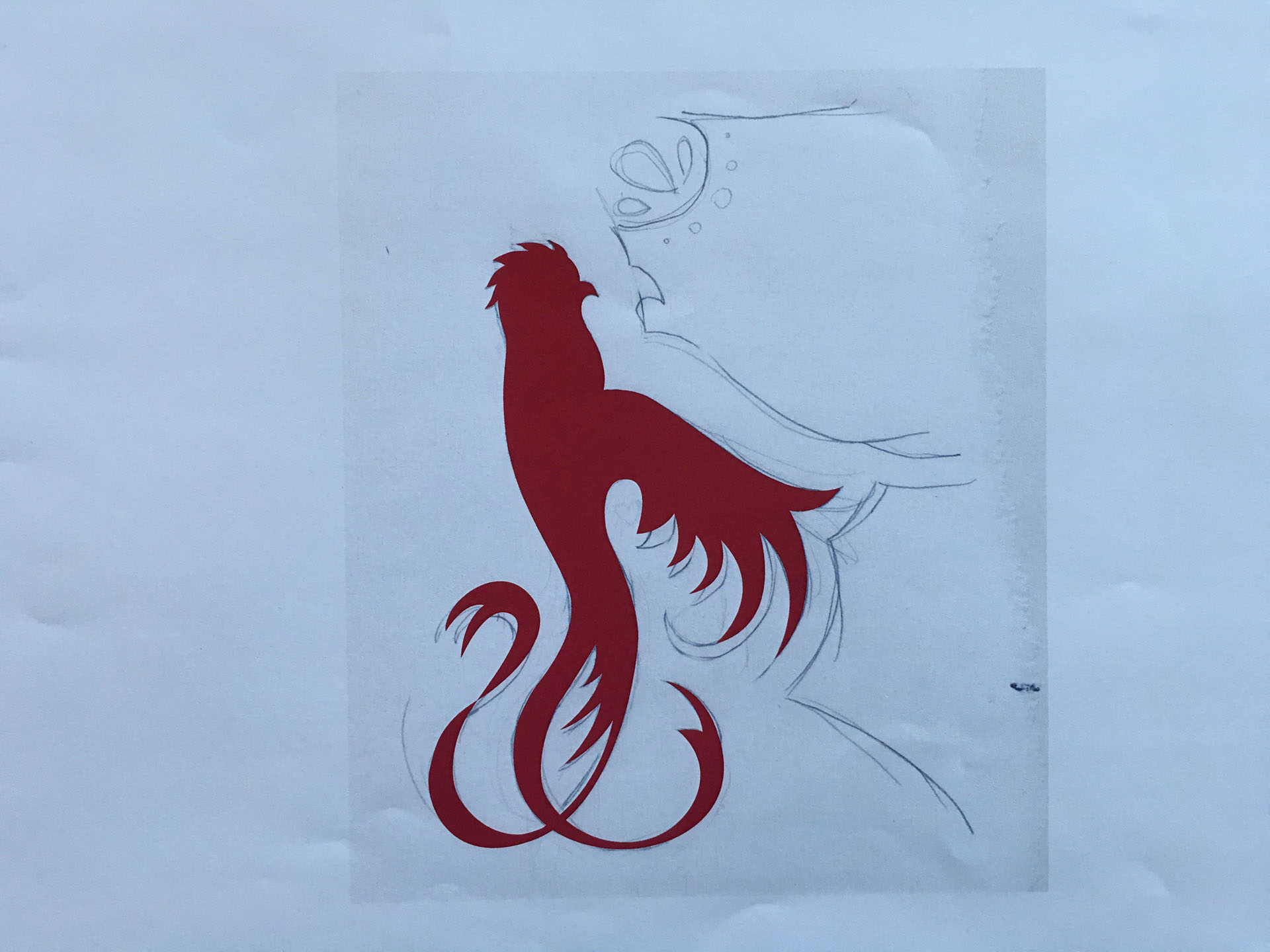
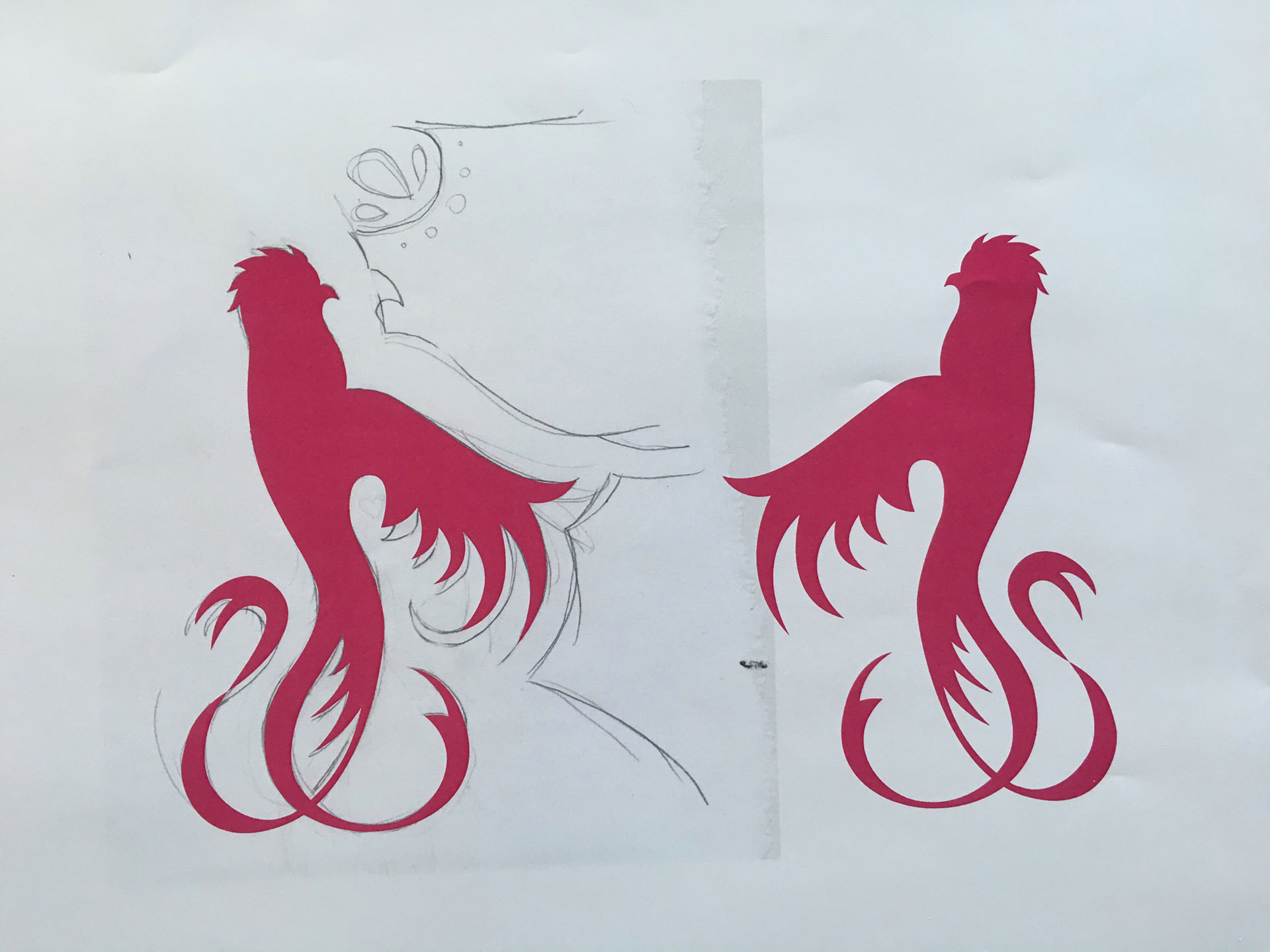
Also somewhat analog, printing out the process. This is less useful for UX/UI - but for something like packaging (that ultimately is a tactile vessel) it's super important to gauge scale and legibility off of the screen.
Don't let the pink throw ya. Typically I work in several values of a solid color before deciding on color-ways. This is a way of determining composition hierarchy.
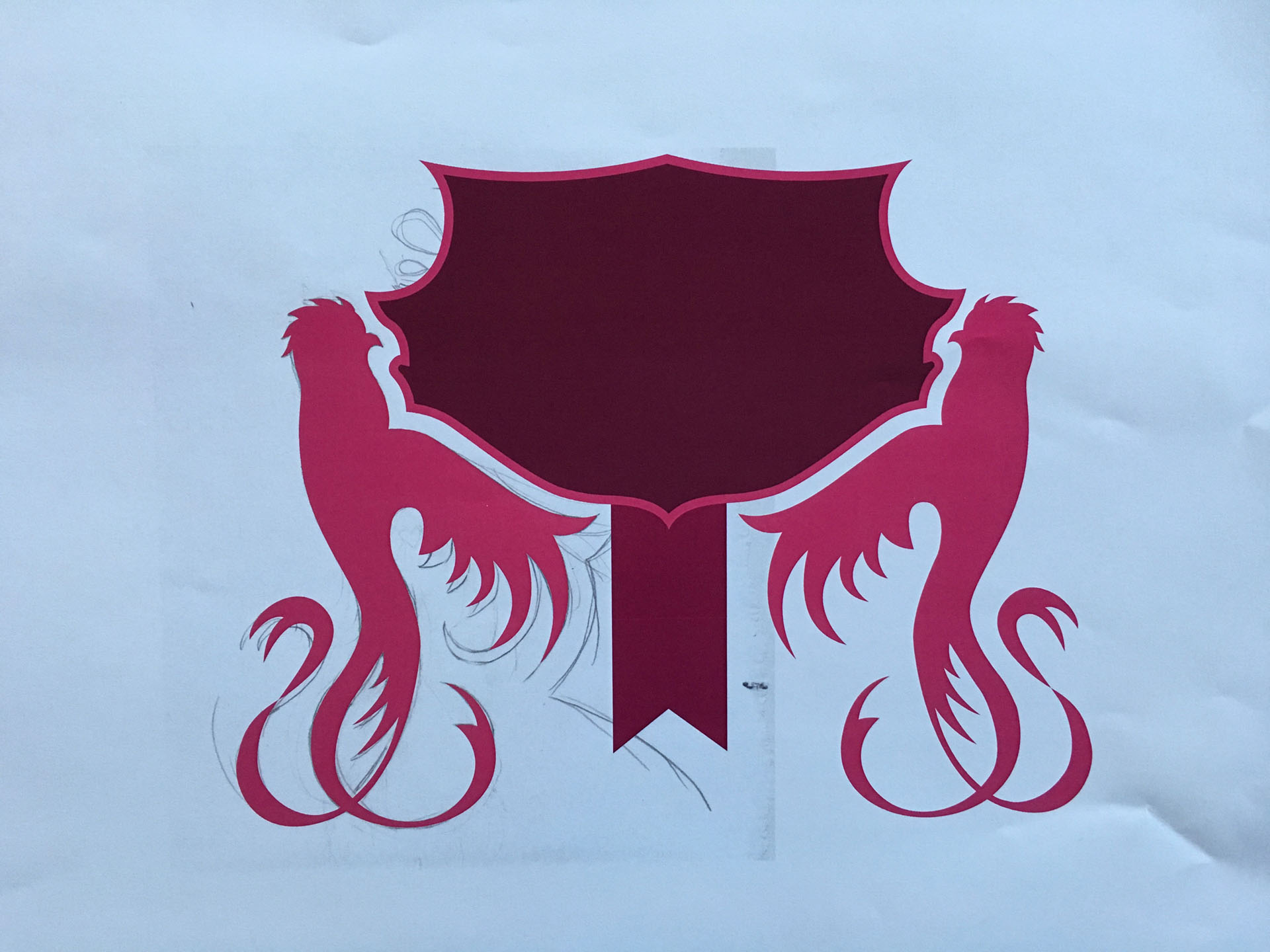
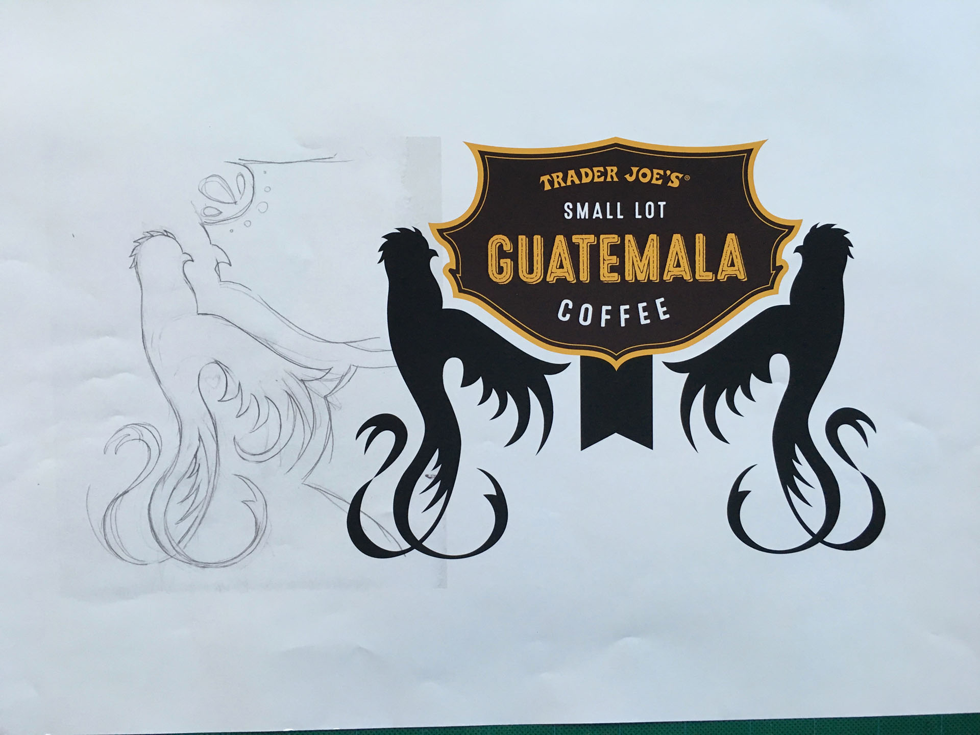
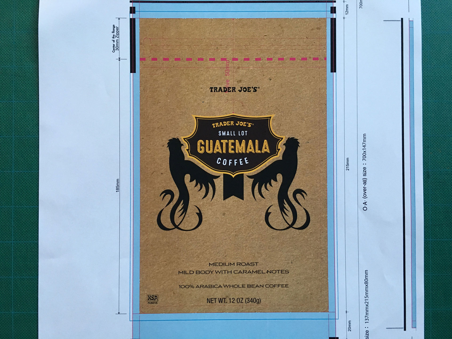
At this point I wanted to start concretizing my type lock-up. But, there's something missing for me.
I brought in a craft texture/substrate but the modern vibe of the silhouettes felt incongruous.
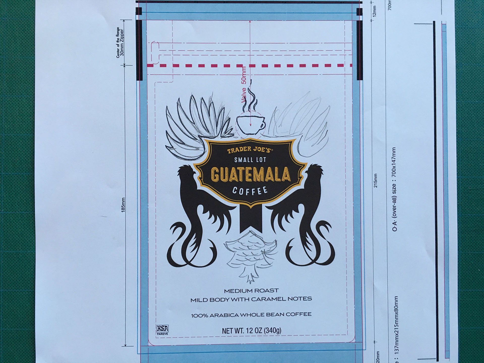
I decided to do some more sketching directly onto the PDP.
Another thing I tell young designers: when you're stuck, push the envelope. Choose a color that seems totally inappropriate or completely wild and off-the-charts. It might not be the thing that sticks, but it could influence other design decision making.
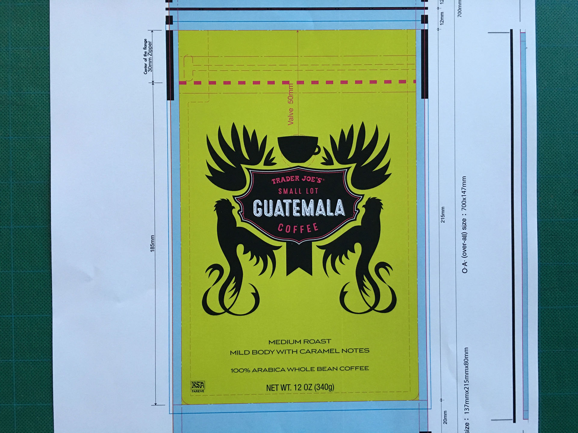
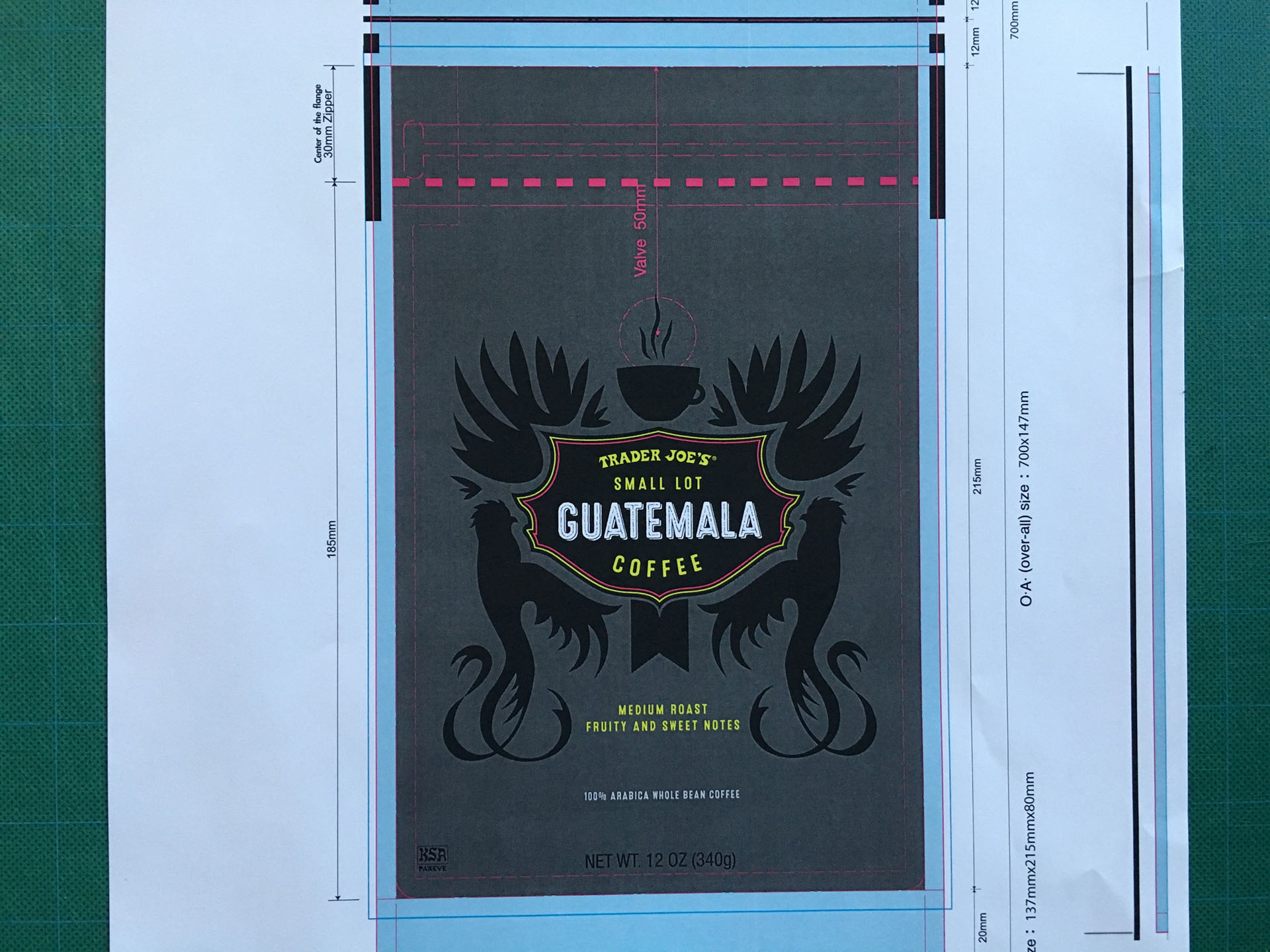
In this case the full-flood neon wasn't the answer but the vibrant magenta and chartreuse made it into the design, albeit in a more subtle fashion. (In the typography, and also patterned on the sides, for example.)
Ultimately I worked with the packaging company to knock-out the printing of the silhouettes to reveal the silver foil of the substrate. This is one of my favorite things I've designed in my career. So fun. This package also influenced the Trader Joe's Small-lot coffee program to be more adventurous and sophisticated.
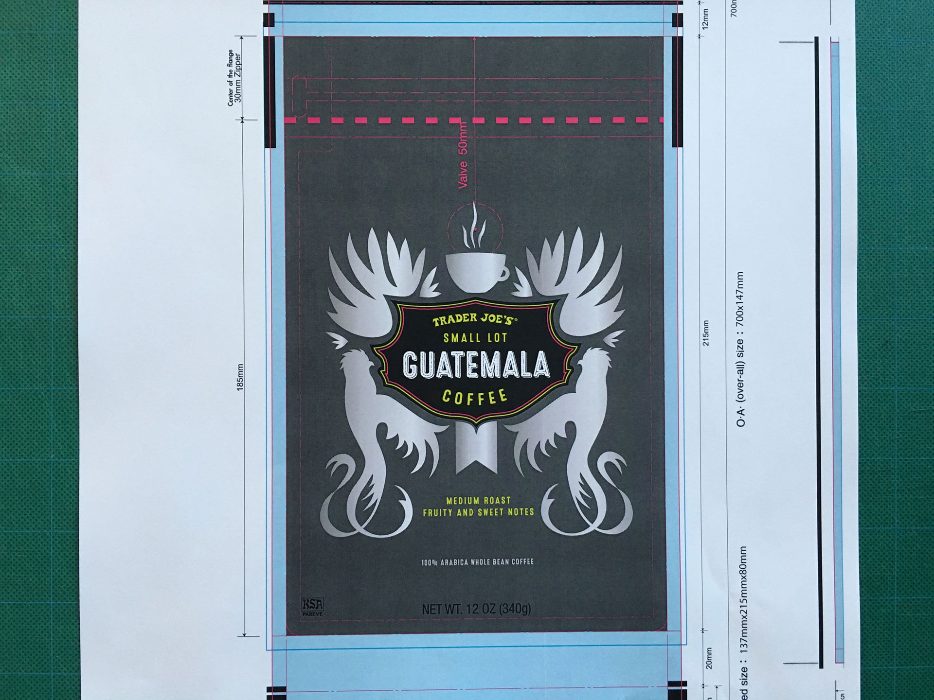
And voila!
